Radha Govind Society

From 2002 a wide range of design projects supported the growth and visibility of the Radha Govind Society of Poland, combining print, digital, and environmental communication. The collaboration began with simple business cards and expanded into posters, folders, brochures, and early websites created in Dreamweaver, later transitioning to Drupal-based platforms with updated layouts and improved functionality. Promotional materials for lectures, yoga programs, and cultural events were consistently designed with a unified visual identity, including flyers, newspaper adverts, and multilingual invitations.
As the organisation grew, branding evolved through new logos, banners, and communication tools such as social media templates and newsletter headers. Major milestones included the design of a new foundation logo in 2016 and a full-page advert in a national yoga magazine to increase recognition in Poland. With the temple’s construction progressing, visual work expanded into decorations, signage, and promotional campaigns.
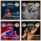
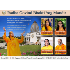
Recent projects reflect a stronger focus on outreach: a redesigned website and updated poster system in 2024, multilingual temple folders, bookmarks, and program flyers in 2025, along with ongoing posters and social media visuals. Together, these projects demonstrate long-term visual consistency, adaptable design systems, and continuous support for cultural, educational, and community-focused initiatives.
Read detailed product descriptions
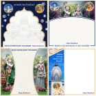
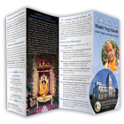
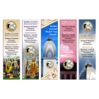
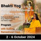
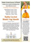
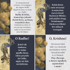
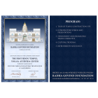
2025: Wit more and more events taking place, also outside of the temple, there was a need for small flyers or cards, which can be shared with public. We decided for bookmarks, 5 x 18 cm, 5 different versions, full colour (front and back). They are unique and timeless. A month later a flyer was made to announce the 4 programs of 2025. During the year several posters and Social media posts were made to accompany the programs. In October a folder about the Temple was created in both Polish and English, printed 1000 pieces each.
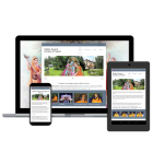
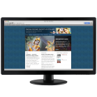
2024: It was time to create a new website, as well as new designs for the posters with different programs taking place.
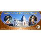
2022: With the temple fully constructed, we helped with some decorations in the main hall (9 boards: 85x85cm, with quotes) as well as templates for the Social Media.
2020: Since the temple is almost complete the new PR campaign is starting. For that we created a header to be used for direct mailing / newsletters.
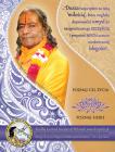
2017: Full Page advert for a Yoga Journal, the Polish quarterly "Magazyn Yoga & Ayurveda". As requested it includes just one picture and a quote, all surrounded by rich decorations (Indian style). With their temple under construction, the organization hoped to get more recognition in Poland, and showed other aspects of the society like yoga and cultural events. Printed in full colour, 210 x 276 mm, circulation: 25,000.
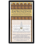
Later in the year, we designed several invitations for an event in Kraków, Poland. The printed versions are A5, double sided, in full color. We made them in two language versions: Polish and English. Both have the same design including a drawing of the temple elevation (updated version of 2015 elevation) and a classical frame with paisley theme.
2016: We created a logo for a new foundation, which will function next to the existing organization: Radha Govind Society of Poland. This new foundation will promote Hindu culture and tradition and organize Yoga retreats. The foundation will also take care of the different celebrations and festivals in the newly built temple. The request for the logo was to not have the emphasis on the spirituality, but on the benefits of yoga and cultural heritage. Several samples were prepared, in gold and blue colors.
2015: Invitation for a Ground Breaking Ceremony. Based on a design we made for a temple in New York (USA) we created this invitation for the ground breaking ceremony of a temple in Poland. It is printed on an A5 folded card (from A4 to A5) in both Polish and English. It was also made into a Digital invitation in English, which can be sent by e-mail.
2014 - 2016: Not even a year after making a new website (when we migrated to Drupal), the decision was taken to change a few things. It was easier to change the website to another Drupal theme and to make all the needed corrections there instead of working on the old one. In 2016, we made a new banner for the homepage.
2013: New website for "Radha Govind Society of Poland" After seven years it got time to make a new website. The old one was still done in Dreamweaver; this one is made in Drupal 7. Many modules were installed, and new content types were made. We then moved the old content to the new site.
Following on the new website, we had developed Small flyer, which was to be distributed at several Hindu events in South-Poland. We took the header from the website and created a single identity by adding (and adjusting) several images already used at the website. Besides that, we also applied the same colours and font. The result is a flyer at size A5, following the website style, printed on one side in full colour.
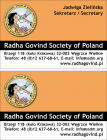
2008: Business card "Radha Govind Society of Poland". Designed in combination with a folder because of a specific occasion. Several versions were made, blank and with names. Full colour.
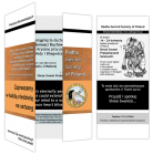
Folder "Radha Govind Society of Poland". Designed to go with the other products; an inlay was designed as well for a specific occasion (designed to be print in house, black&white, 3 on A4 size paper.). Folder printed in full colour offset, 4/4, 1.000 copies, 170 grams. Folded asymmetrically with an opening of 1 cm. Size: A5 when folded.
Flyer was designed to be printed in house on standard A4 paper. Its design was based on the original folder but this is cheaper and easier to change and distribute. It has all the important information that is required.
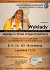
2007: Poster "Radha Govind Society of Poland" Printed on B1 size, full colour, 500 pieces, announcing a series of speeches. Made in the style of website and the folder created in the same year, it was distributed across the city by an advertisement company.
Another Advert was designed for a local newspaper, which was concurrent with a poster about the same series of speeches. It was in black&white, made in the same design with lines and accents.
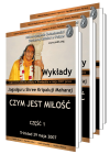
Series of speeches for "Radha Govinda Society of Poland". The brochures are A4 and printed on location. We designed the covers in the same style as the poster and the website. The contents is B&W. The text exists of Sanskrit fonts as well as normal Latin fonts. The brochures count between 4 and 12 pages, they are stapled.
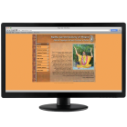
2006: Website "Radha Govind Society of Poland". Made for a foundation that is working with raising interest in the old Indian culture and philosophy. We used extra high security demands because we used old and archival illustrations and to prevent texts form being copied without permission of the organisation itself. The website started with 25 pages but expanded. Completely in Polish. Made in Dreamweaver.
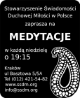
2005: Poster. Black&White poster on A4 printed on colour paper, distributed across the city - this was the meaning. It should not be expensive, but still have a nice look. Printed on spot, on yellow and orange paper. Advert: 4,6 x 5,7 cm. A small advertisement in a local newspaper, black&white.
2002: it started with a business card...


