PreHistorisch Dorp

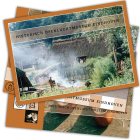
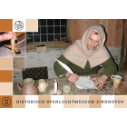
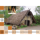
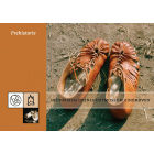
Over several years we produced 35 design and communication products for this client, ranging from small promotional items to complex digital platforms and large-scale printed materials. Our collaboration began with simple shop products such as bookmarks and postcards, and gradually expanded into newsletters, posters, flyers, annual reports, and educational materials aimed at families, schools, and museum visitors.
A major focus was the development of the museum’s digital presence. Between 2005 and 2006 we designed three large thematic websites—Iron Age, Vikings, and Middle Ages—together covering more than 800 pages, as well as a new main website, an online shop, and a dedicated symposium website. We also created slide presentations, conference materials, and online content that supported the museum’s educational storytelling.
Alongside digital work, we developed exhibition banners, event advertising, placemats, activity cards, and targeted folders for schools and local audiences. Large-format posters and fabric banners helped promote seasonal events and attractions at the museum entrance.
Overall, our work combined graphic design, web development, and strategic communication, helping the museum present its programmes clearly, engage diverse audiences, and strengthen its public visibility both on-site and online.
Read detailed product descriptions
We made 35 products for this client over the years, varying from a simple Bookmark until a Website covering several hundreds of pages.
2007: In the last year, we developed an advert for the shop, printed in euroREA a Journal of EXARC. Size 89 x 135 mm, printed in euroREA (circulation of 1.000).
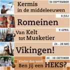
Several banners were designed and printed - a full year of events and attractions; all banners for this needed to be made in one go. This totalled in 11 banners, 450 x 60 cm, printed on fabric in full colour. They were presented near the museum entrance in series of three.
A Folder was developed for schools in the direct vicinity of the museum (a new target group) for a programme on location (not in the museum).
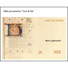
2006: several slide presentation were made to use on the website on different topics: "Fashion from prehistory", "Waldo, an Iron Age story", "Fashion from the Middle Ages" and "Lust & Sin". See the presentation "Lust & Sin" (Flash Plug-In required). We also made several PowerPoint presentations for external conferences.
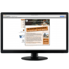
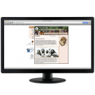
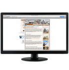
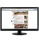
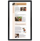
2005 - 2006: We made three thematic websites for the Historical Open-Air Museum Eindhoven (Website "Iron Age", Website "Vikings" and Website "Middle Ages"), which by January 2007 counted over 800 pages all together. The client himself maintained all three of them from January 2007 onward. Every thematic website has the same structure for kids, questions and answers, a number of stories about that specific era in the Brabant province and in Europe. Following the other websites we made, they asked us to develop a new ‘main website’. The old one was already a couple of years old and not up to date anymore. June 2006, this website had an orderly navigation with about 75 pages, nice animations and attractively offered to the user.
Later we also created a shop online and special website for a Symposium taking place late 2006.
2004: Over a period of about a year (June 2003 – September 2004), six printed newsletters were made, size A4, double sided, black&white printed on previously printed background in brown, 160 grams. Following on this the museum changed to a digital newsletter which was also prepared by Mohini Visions.
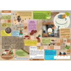
One of the top products of that year was a placemat: A nice occupation – puzzling through the Middle Ages. At the back, you could find all answers as well as the year programme of events. The front side (full colour) was printed in a high number, with every season a part of them being printed in black&white. This product was used for three years in the museum restaurant and several restaurants in town. A3 size, 160 gr.
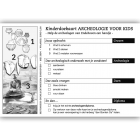
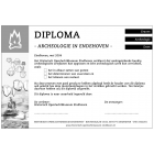
We also prepared a personalised "archaeological diploma", printed in the museum itself, black&white, size A4 . Besides this, a card was designed which the children ran through the whole course and scored points at each station.
This newspaper promoting the Construction of a logboat was designed in the museum and was planned to get sponsors interested. Mohini Visions was asked to do some fine-tuning. Made in size A3 folded to A4, full colour, 8 pages.
Flyer "Children-Play-Activities" We developed a flyer to advertise the activities the museum had developed for children (not for school groups). The offer was about children activity cards (Sundays and children’s holidays) which did not need to be booked in advance, children birthday parties (on appointment) and other pre-booked children programmes. The use of photos, colours and the glossy appearance was needed to create a ‘cool’ image. Printed, 10 cm x 21 cm, 160 gr glossy paper, full colour.
We made several posters about upcoming events throughout the year. The "Medieval Fair" Poster was one of them. It was printed in two colours (black and brown) at size A0 and placed along the roads in Eindhoven to advertise an upcoming event.
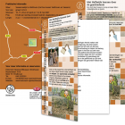
2003: Three info pamphlets about “hot” items in the museum, to be distributed among the visitors. Printed on A3 size, folded to A4, a strip cut away at the front side. To save money, the paper was pre-printed in one colour (PMS723) following on that, it was printed in black&white.
Also we prepared postcards: from the 20 drafts we prepared and presented, eight postcards were selected and produced (5’’ x 4’’), full colour, 160 grams. Everything was made in the prescribed corporate identity, also the backsides.
For several years we also designed the Year Reports of the museum.
2002: As a first project we made for this museum, we made a bookmark (3,5 x 19 cm, 260 gr paper) with some favourite images of the two eras the museum represented. It needed to be made in the corporate identity the museum had recently embraced. The bookmark was a simple teaser. Another reason to develop such a simple but effective souvenir was to have a more varied offer in the museum shop in different price categories.

