Family & co

From the beginning of Mohini Visions, supporting family and friends has been an important part of the work. Projects ranged from joyful celebrations to sensitive moments that required care, speed, and close collaboration. Over the years, a wide variety of designs were created, including invitations, wedding packages, funeral materials, postcards, photo albums, websites, and small publications - always adapted to personal wishes and circumstances.
Early projects included websites built in Flash or Drupal, stationery, business cards, and creative print items such as postcards and CD-ROM publications. As relationships grew, more personal commissions followed: a full wedding package with coordinated invitations and printed materials, photo books capturing shared memories, and custom invitations for workshops or special events. Some of the most meaningful work involved funeral sets designed at very short notice, where mourning cards, program booklets, and presentation slides were created in respectful visual styles that reflected the individual being remembered.
Alongside these, smaller projects such as Christmas cards, cookbooks made from holiday experiences, and community websites demonstrated a flexible, personal approach to design. Across all projects, the focus remained on trust, empathy, and creating thoughtful visual solutions that strengthened personal connections and lasting memories.
Read detailed product descriptions
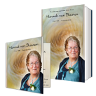
2015: Funeral set. At very short notice, we received the request to design several products for a funeral: a mourning card to invite guests and a program booklet for the service. Everything needed to be made at high speed and in good cooperation with the close relatives. We chose a colorful design which fitted well with the deceased. We applied white roses as common theme everywhere (photos and drawings).
The mourning card was printed at 14 x 24 cm, folded to 14 x 14 cms. Inside and outside were both in full color. The circulation was 100 pieces, printed at 300 grams pearl paper and delivered with a square white envelope. The program booklet for the service counted 16 pages (including cover) and was printed in black and white, double sided at 90 grams white paper, with a cover in full color at 120 grams off white. The size was A4 folded to A5, circulation 150.
2014: Christmas Card. 2014 was a year full of changes, including two changes of addresses. That is why we decided to print a Christmas card and send it to many business partners, friends and family. It measured 148 x 148 mms, printed on 300 gr paper, full color on the front, black & white on the back. The circulation was 150 copies, posted early December 2014.
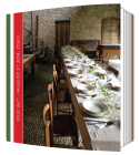
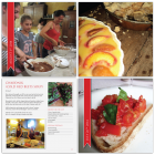
Also in 2014: A cookbook full of memories... During this holiday week in Italy, every day someone else was cooking. It was a fantastic time with great memories. That is why we took the decision to publish a book with the recipes and photos: all these different dishes offered enough material to compile an interesting booklet. Every day is covered in 6 to 10 pages where each recipe is explained in one or more photos. In between one will find several pictures offer more impressions of this holiday week. The booklet ended up being 56 pages thick, 21 x 21 cms, full color. It is printed in a circulation of 15.
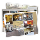
2013: Invitation. Three pages invitation for an international workshop, describing the reason and the location (page 1), the facilities (page 2) and accommodation (page 3). This was sent as PDF so there were no restrictions about size, colors or costs. It was made as A3, but can easily be printed (and still legible) on A4.
Funeral set. We were requested to produce several products at very short notice for a funeral: a program guide and a slide to be used at the ceremony, a card for later. All items were made in a hurry and in full agreement with the family. The program guide counted 12 pages and was printed double sided in B/W on 90gr off white paper, with a full color cover on off white 120 grs paper. The size is A4 folded back to A5, circulation 15 pieces. We also made a slide, in the same style with a picture and short text. The card was meant for friends and contacts, to be sent after the funeral and was printed on A5, folded to A6. The outside is in full color, inside B/W. Circulation was 200 pieces, on 300 grs paper and goes with an off white envelope.
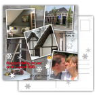
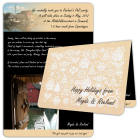
2011: Invitation for a special event. For a special event, taking place in May 2012, an invitation was requested. To combine a few ideas together - the front was prepared as Christmas and New Year wishes (using a design of HEMA), while the inside was completely dedicated to the event. With two images, more info and in a color schedule similar to the cover, it formed a successful combination. Printed in full color on glossy photo paper, at HEMA.
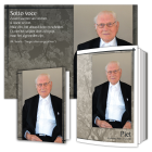
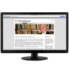
2009: Website "P.C. Paardekooper". Made in Drupal with a standard, slightly changed, theme called "Nitobe". This was easy to maintain by the client himself. We added a few articles to start with, as well as a Bibliography, Glossary and Biography.
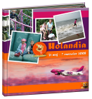
2008: Photoalbum "Zielonki in the Netherlands". It only counts 46 pages (30 x 30 cm) so it actually is no book. Printed at HEMA, Mohini Visions used Photoshop for the design when every day got another atmosphere.
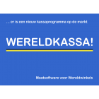
2007: Postcard "Wereldkassa". This card was made for a new compagny which had just launched its first product: a software programme for small retailers (POS). It goes back on the design of the website of this company and was realised in close cooperation with the client. The card was printed in 250 copies and sent by the end of the year, accompanied by New Year’s wishes.
2006: Stationery "Zielińscy International". Design together with the logo, can be printed at home as it was prepared as background for an MSWord document. In two colours schemes: colour and black & white.
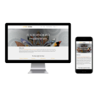
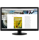
Website "Brechtje.nl" Starting point was to create a frameset by means of which a few subjects could be combined like for example the blog (which is hosted elsewhere) and additional author information (Brechtje).
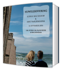
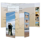
Wedding Package. A complete set of printing which includes all for the wedding: two kinds of invitations (for the guest who joined all day or just two of the parts - see the illustrations for more explanation: invitation 1 & 2), an inlay (for extra guests), stickers / thank you notes, a church book (interior and outside cover), personal menu cards... all of that in one style and also in one size 21 x 21 cm. Everything was printed in full color (except for the contents of the church book, which was printed in black-and-white).
Poster (A3), flyer (10 cm x 21 cm), cover for the programme booklet (A5) and entrance tickets - "The Unicorn..." for chamber choir "Akkord". All printed on colored paper.
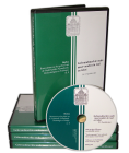
2004: Book on Cd-ROM "Gebrandmerkte oude meervouden in taal en tekst". 900 pages, A4 format; transformed from WP 4.2 to MSWord and subsequently designed / edited; published on CD-ROM. Besides the contents, we also developed the CD Label and box cover.
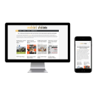
Business card "Mohini Visions". In the style of the website (at that time!), printed full folor 4/0.
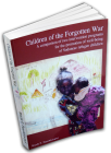
2002: Doctoral thesis "Children of the Forgotten War" Soft cover 260 gr laminated, interior B/W, 282 pages. By request, we did not only do the design, but accompanied the full process up until the printing and delivery for which we have experience in the Netherlands and abroad. We developed the graphic material in close cooperation with the client.
2001: Animated Greeting Card "With You" This animation was made for a Polish company in animated greeting cards. The texts are therefore in Polish. The translation: "In my thoughts I am somewhere else... ...with you." See animation as Animated Gif
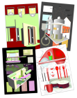
Study projects as postcards.Prepared for the final exam exhibition as set of four picture postcards with extra information at the back. 210 gr, full color, 4'' x 6''. They describe my best four projects presented at the exhibition.
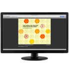
2000: Website "Stichting Poort" This website was designed for a Dutch foundation. We made the site completely in Flash, besides of which there was a possibility to read the texts only, in HTML. The choice of adding all buttons in the shape of flowers on the homepage was deliberate. Maybe one needed to search a bit, but the site was otherwise not "deep". On average, the site counted 20 pages.

