Mixed Archaeology

This page presents a collection of smaller archaeology-related design projects - for various clients - created over many years, including adverts, posters, websites, logos, and exhibition materials. Since 2007, recurring work has involved producing advertisements for archaeological museums and organisations, especially for EXARC publications. Recent highlights include exhibition side panels for Batavialand (2024), a poster for an Experimental Archaeology weekend in Denmark (2023), and a journal advert for Ancient Dust Busters (2022). In 2021, a research project logo for Leiden University was designed alongside social-media video editing, while 2020–2021 saw the creation of a responsive WIX website for Stiftung Schloss Marienburg.
Earlier projects include PR support for REARC and Colonial Williamsburg (2019), a responsive website for Spinglevend Verleden (2018), and a trifold political folder promoting museum ideas (2013). Historic work ranges from educational and conference websites (2004–2007) to newsletters, multilingual museum platforms, and logo design such as EXAR (2002–2003). Across these varied commissions, the focus remains on clear communication, consistent branding, and visually engaging presentation tailored to archaeological audiences.
Read detailed product descriptions
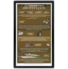
2024: End of the year we created two side panels for een exhibition at Batavialand (NL) about shipwreck found at the bottom of the sea near bij. The panels are 63 x 105 cm, and have mixed collage of different images from the excavation and the artefacts.
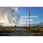
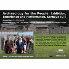
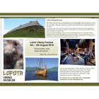
2023: A poster for a weekend of Experimental Archaeology in Denmark was made, both for printing and social media.
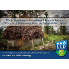
2022: A small advert was designed for Ancient Dust Busters, to be placed in EXARC Journal Digest 2022, 90 x 134 mm
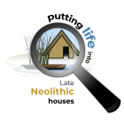
2021: We designed a logo for a NWO project with Leiden University: "Putting life into Late Neolithic houses: investigating domestic craft and subsistence activities through experiments and material analysis". Later in the year several videos were edited to publish on Social Media.
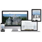
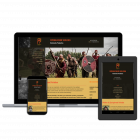
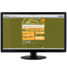
2020-2021: In January 2021 we finished working on a website for an association of the Castle Marienburg (Stiftung Schloss Marienburg), it is made in WIX, responsive design, and client will be able to add extra information by himself. See https://www.stiftung-schloss-marienburg.de
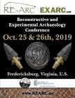
2019: both in 2018 and 2018 we helped with PR compaign for REARC conference in USA. Working with draft versions of the flyers, making it look good. The same counts for Colonial Williamsburg Foundation and its advert about the fellowship. All products used on line and as adverts.
2018: Responsive Design Website for Spinglevend Verleden. This is the first website for this client, and we decided to go for a low-budget small website, instead of using Drupal. We made this using the SiteBuilder of the website provider; we added some extra scripts and made several small graphic changes. The website consists of 15 pages.
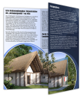
2013: A small folder for politicians... A trifold folder, printed on A4, in full color. It is to present new ideas of the museum to politicians. Therefore it contains more text then you would usually find in a folder. The outside was designed with dark colors and historic pictures to create a better contrast with the plan explained inside: light colors, modern pictures. A nice element is that one of the pictures placed outside complements the image inside, making it inviting too read further.
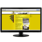
2007: Website "Magical Heiloo". All 10 elementary schools of the village of Heiloo together in one history project: this website was meant to keep everybody informed for the full year 2007 – 2008 showing what was happening where. The interactive part was maintained by the project leader and the coordinators at the elementary schools, other updates were made by Mohini Visions. The graphic proposal for this website was made by Irene Mulder.
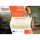
Also in 2007 we made a poster for the "Conference in Exeter 2007". The University of Exeter had a specific corporate identity, which had to be applied when making this poster (A4 size, full color). It was a call for an international conference, which was also used for a PowerPoint Presentation. Both products were made for the organisers of this conference. The poster was printed at university but was sent as PDF to other universities in the United Kingdom as well.
2007-present: every year we make adverts for different archaeological open-air museums for the magazine of EXARC. Until 2010 this was euroREA, after that the EXARC Digest Journal. The adverts vary from a quarter page: 90 x 134 mm, half page: 190 x 134 mm to a full page: 190 x 277 mm.
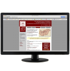
2005: Website "Conference of Matrica Museum". This website was made for a conference held at the Matrica Museum in Százhalombatta, Hungary. It is a simple site with only six pages containing the most needed information for those interested. Completely in English. Off line since June 2006.
2004: Website "The Delphi Project". This website was about the cooperation of 35 museums. It was available in 14 languages and in January 2008, there were 280 questions and answers in the database, a series of 750 links and a heavy animation of Europe. The most important part was the complicated PHP programming (among others for the database). The customer had access to add more information on their own and could change existing information.
2003: Digital Newsletter "To entrepreneurs in Dutch archaeology". A onetime only newsletter meant for the Archaeological World in the Netherlands following a commission by Hazenberg Archaeology. Including *.gif animations.
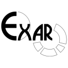
2002-2003: Logo "EXAR" This logo was meant for a German Association that planned to "go European" (European Association for the Advancement of Archaeology by Experiment). The font was already known. It was important to follow a 'scientific' character, therefore the circles refer to statistics, as well as to the empiric cycle. Even the 'cake points' refer to an experimental archaeological theory. Later we made a Folder cover "EXAR" - we redesigned the cover of the existing folder, with the logo already playing an important role. The circles of the new logo were also used for the new design of the cover. Printed on 160 gr, full colour, 10 x 21 cm when folded.


