Archeo Interface

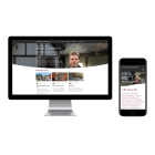
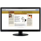
Since 2007, Mohini Visions has supported Archeo Interface with web design, publications, presentations, and promotional material. The first bilingual company website (2007–2008) introduced the consultancy’s work online, featuring a complex Drupal setup with databases linking literature, museums, and articles, allowing the client to manage and expand content independently. A redesigned Drupal website followed in 2012, focusing on updated projects, improved CMS functionality, and social-media integration such as Twitter. In 2023, the site was rebuilt again, this time in WIX, providing a modern responsive design, easier maintenance, and refreshed content while preserving the core identity.
Alongside web development, Mohini Visions created conference PowerPoint presentations aligned with the brand style, a full-colour SPNF report emphasizing clarity and cohesion, and advertisements for EXARC publications. Across these projects, the emphasis remained on accessible communication, flexible content management, and a consistent visual identity that evolved with changing technologies and the client’s growing professional activities.
Read detailed product descriptions
2023: More than 10 years after previous website was made in Drupal, we made a new website this time in WIX. The previous website could not be updated anymore, and needed new theme as well as upgrade, so changing all to WIX, which is less maintenance heavy, was a simply solution. With less of the options comparing to Drupal, we still created a fresh looking pages with old (but updated) and new content. And what is very important this one has a Responsive Design.
2012: The first website for this customer was made 2007 - 2008. Over five years later it was time to create a new site - with a new look, completely in CMS (Drupal) and with upgraded information about recent projects. We made the website in such a way that the client can update all on his own. We also included some modules linking with social media, like a Twitter application. The website is in English. Check the website. With this website, we focused on the projects done by Archeo Interface. The extended database with Bibliography and Archaeological Open-Air Museums was moved to EXARC in 2011.
2007 - present: over the years Mohini Visions has developed several PowerPoint presentations for Archeo Interface, all following the style of the website. These presentations were used at different conferences, lectures at universities and workshops.
2007: Report "SPNF". The design of this report (size A4, full colour, 31 pages, circulation 10) needed to underline the message: a rescue plan for an initiative with many possibilities for development. The design was also used to create coherence between the very different chapters and points of view. The colours and design of the report were derived from those used in the organisation.
2007: Advertisement "Archeo Interface" for EuroREA 2007. We prepared this advertisement or the Journal of EXARC, euroREA. The size is 89 x 135 mm, printed in euroREA (circulation of 1.000). See Images for this and other advertisements made by Mohini Visions for EuroREA in 2007.
2007 - 2008: This bilingual website counted at the beginning (in 2007) 10 pages in every language and is the presentation of a small company which advises in archaeology. All illustrations were already digitally available; texts were produced on the spot. We used Adobe Fireworks for the first time, especially for the button sets. In 2008 we redesigned it and changed into Drupal, when different modules needed to be applied and made fit. This project took almost a year to conclude due to the extended amount of modules and unusual lay out. The database linked literature references with museums, photos, a glossary and articles. The client managed the content by himself and continuously expanded it.


