CXResearch Inc.

From 2002 to 2020, we developed for CXResearch Inc. a range of branding, web, and promotional projects focused on herbal supplement marketing. Early work included HTML websites with Flash animations (2002) and product packaging such as Rafani Plus (2004). In 2006, a full CSS-based website with webshop functionality and a 25-year anniversary emblem were created, followed by unified packaging designs and a promotional brochure in 2007. A short animated TV commercial explaining a medical supplement was produced in 2013. By 2015, the company launched a new responsive, sales-focused website with clear product navigation, banners, and modern shop design. Finally, between 2019 and 2020, the website was rebuilt using the WIX platform, offering more flexibility, updated themes, and redesigned social media headers. Overall, the projects show a steady evolution from basic web presence and packaging toward modern e-commerce, cohesive branding, and digital marketing.
Read detailed product descriptions
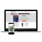
2019-2020: End of 2019 it was time for a new website, this time it was decided to switch from Drupal into WIX system, a very modern site builder program with lots of possibilities and themes. Also new headers for Social Media were created.
2015: CXR new website. With new products at CXResearch, it was decided to make a new website, which instead of being just a "product-info-website" will this time focus on selling. Therefore, we selected a shop theme, which would best show the new products. It follows the latest trends by its easy navigation, with a clear description of each product and different background information (for example 12 articles at 08-03-2015). Mohini Visions was responsible for the design and styles. Of course, the website uses Responsive Design. We also made banners for each of the products. See website for more details.
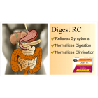
2013: Animation for TV commercial. For a TV commercial a short (12 seconds) animation was needed which would explain how a medical supplement works. See the animation (Flash Plug-In requiered). The idea was to show how the main organs are in trouble, and only after taking the supplement the stomach, liver and pancreas would become at ease and the intestines start working properly. We purposefully exaggerated the working of the organs, so the effect is clear within a few seconds. Two versions were made. One is shown here; the other one was in cartoon style including smilies. In this commercial, the latest version (in Spanish) is shown.
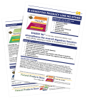
2007: Brochure "New Products of CXResearch Inc." Made to promote the three products, which have been on the American market for some time already, imported by CXResearch Inc. from Europe. The products got three new design boxes, so the company also started a new campaign to promote them. Printed on letter size, 4 pages.
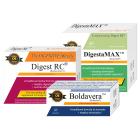
2007: Boxes for Herbal Supplements "Boldavera", "Digest RC" and "DigestaMAX". Following some research, it was decided to apply the same design to all products of this company, following the design of the first product: Digest RC. The old box designs, which Mohini Visions had previously designed, became obsolete. To all boxes, an emblem was added which was designed a year before, for the 25 year jubilee of CX Research Inc. All designs were in full color, the sizes remained like in the old designs.
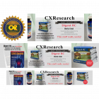
2006: Emblem "CXResearch Inc." CXR Incorporation existed 25 years by 2006. For this occasion, the request was to design a festive emblem, which the company could for example use on their website.
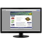
2006: Website "CXResearch Inc". This website was designed for a company in Florida who sells European herbal supplements in the States. We added a web shop to the site and did the full design. The site uses Cascading Style Sheets (CSS). April 2008 we changed the site into Drupal, but the looks remained unaltered.
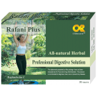
2004: Box for Herbal Supplements "Rafani Plus". This product is being sold on the American market. An emphasis is made on a good graphic design - a healthy, optimistic presentation of the product. The color scheme should be natural. Printed full color, 11 x 8 x 1 cm.
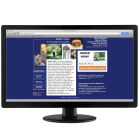
2002: We designed a website for an American company selling European herbal supplements under two names (Rafani Plus and Digest RC). The site is made in HTML using some Flash animations. Both parts of the site exist of averagely five pages. In February 2006 they were renewed.

