2009: Final report for EU Project "liveARCH" At the end of this 3-year EU project, a report for Brussels needed to be compiled. Mohini Visions collected all texts, annexes and financial attachments and designed them into one single identity. It was turned into 68 pages, 58 printed double sided, the last 10 single sided. The texts and the financial report were full colour, the annexes in black&white.
2009: Eight "Quality Development Plans" An important result of an EU project (liveARCH) was the series of eight quality development plans. Each of the eight museums had analysed itself following predefined themes. The Swedish partner in the project coordinated the questions and gathering the answers; Mohini Visions edited the eight plans and did the graphic design. The original contents was expanded with an introduction per museum to contextualise the answers; also, the definition of archaeological open-air museums was added and relevant quotes from the respective marketing plan. Eight reports, each in full colour, between 22 en 26 pages. The plans were designed according to the existing corporate identity of liveARCH / AOAM.
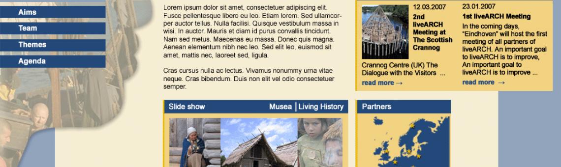
2007: Website "liveARCH" The website of the European Project liveARCH 2006 – 2009, was made of a static part (among others an explanation about the project, partners, themes) and an extensive dynamic part which was completely maintained (admin) by the customer: a large database with lots of options: a calendar with meetings and exchanges, press releases, news items etcetera. All eight partners could add their own news items. Since 2016, the static part can be seen at EXARC.
2007: Symbols of liveARCH themes For the different themes of liveARCH, an EU project we designed the symbols to use for different occasions (printing, website et cetera). As base, we used a design created for the German theme "Events Coordination", with the number 17 on it. The other seven are related to other themes: The Dialogue of Knowledge, Exhibition & Catalogue, Skills Training, Staff Exchange & Website Coordination, Marketing & Communication, the Dialogue with Visitors and Quality & Sustainability Development.
2007: Logo "liveARCH" This logo was meant for a 3-year EU Project (2006-2009). It counts eight partners of liveARCH, coming from eight different countries with not only different cultural but as well organisational backgrounds. After showing a large number of sketches, a number of demands were more clearly described: the EU colours, stars, two faces and live needed to be written in italic, followed by ARCH in capital. Following on this, we designed two versions to be used in portrait and landscape format, of course both in full colour and black&white. With the logo, we also designed the stationary, which was used for different flyers and during the conferences.
2006: end of 2006 several Power Point presentations were developed to present the liveArch project.

 was the series of eight quality development plans. Each of the eight museums had analysed itself following predefined themes. Eight reports, each in full colour, between 22 en 26 pages. It was designed according to the existing corporate identity of liveARCH / AOAM.")
 beyond the group of eight museums. Printed on size A4 in full colour.")
 and an extensive dynamic part which was completely being maintained (admin) by the customer: a large database with lots of options: a calendar with meetings and exchanges, press releases, news items et cetera.")
")